Colours
Choosing colours for two-plate printing.
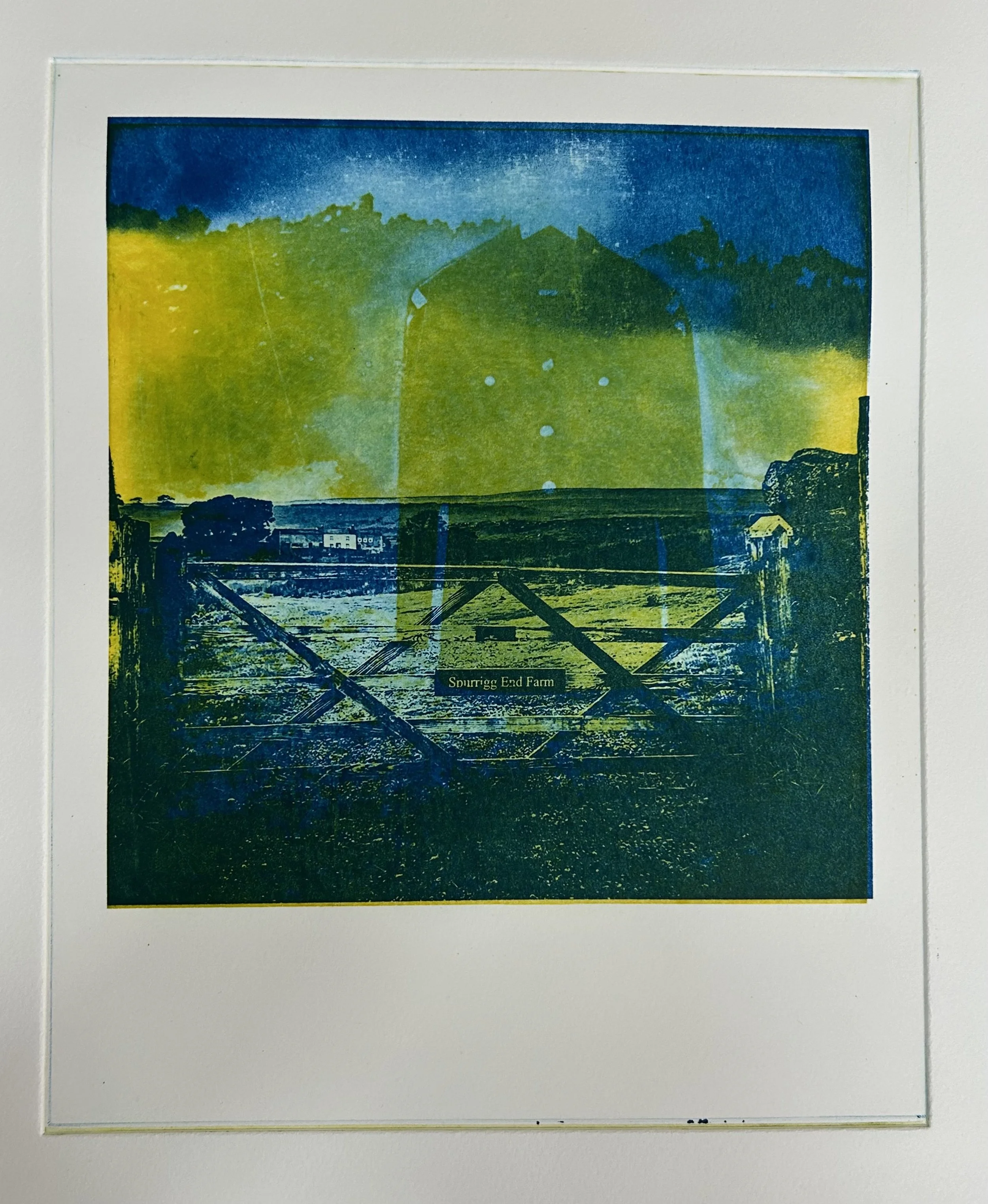
To test colour combinations swiftly, I used Photoshop to gain a quick idea of colours. Yes, the samples are very saturated in hue, but it was the combination of semi-transparent ink transparency that was interesting.
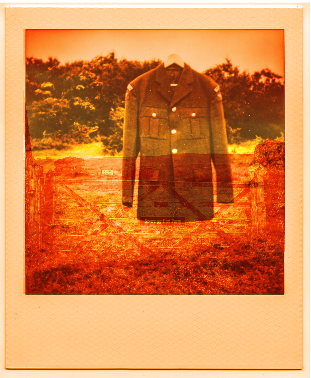
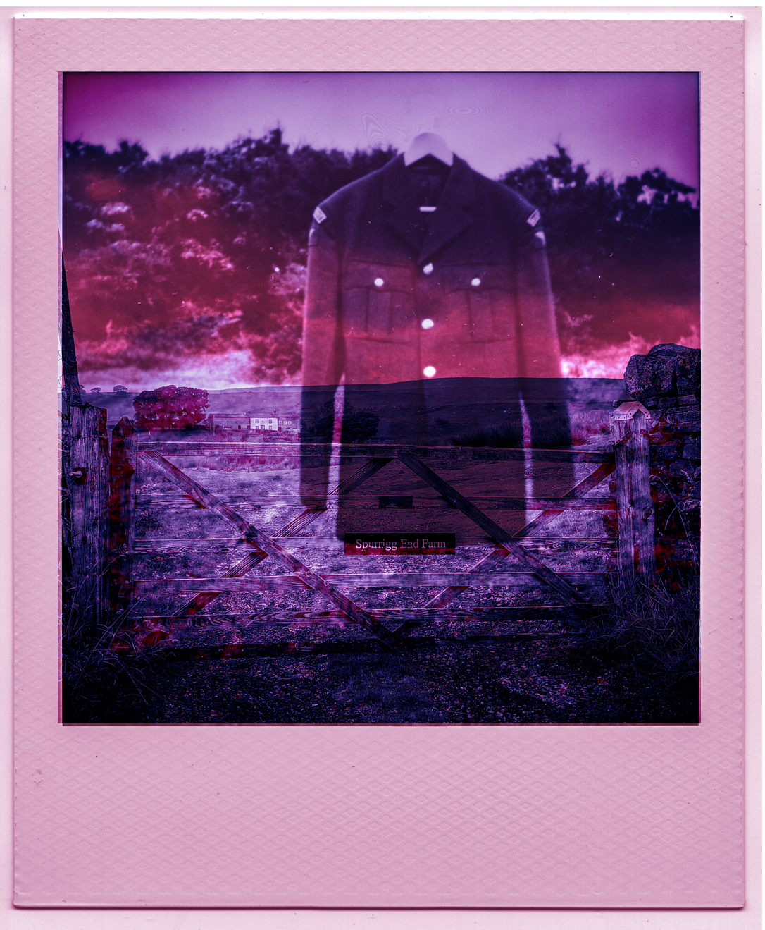
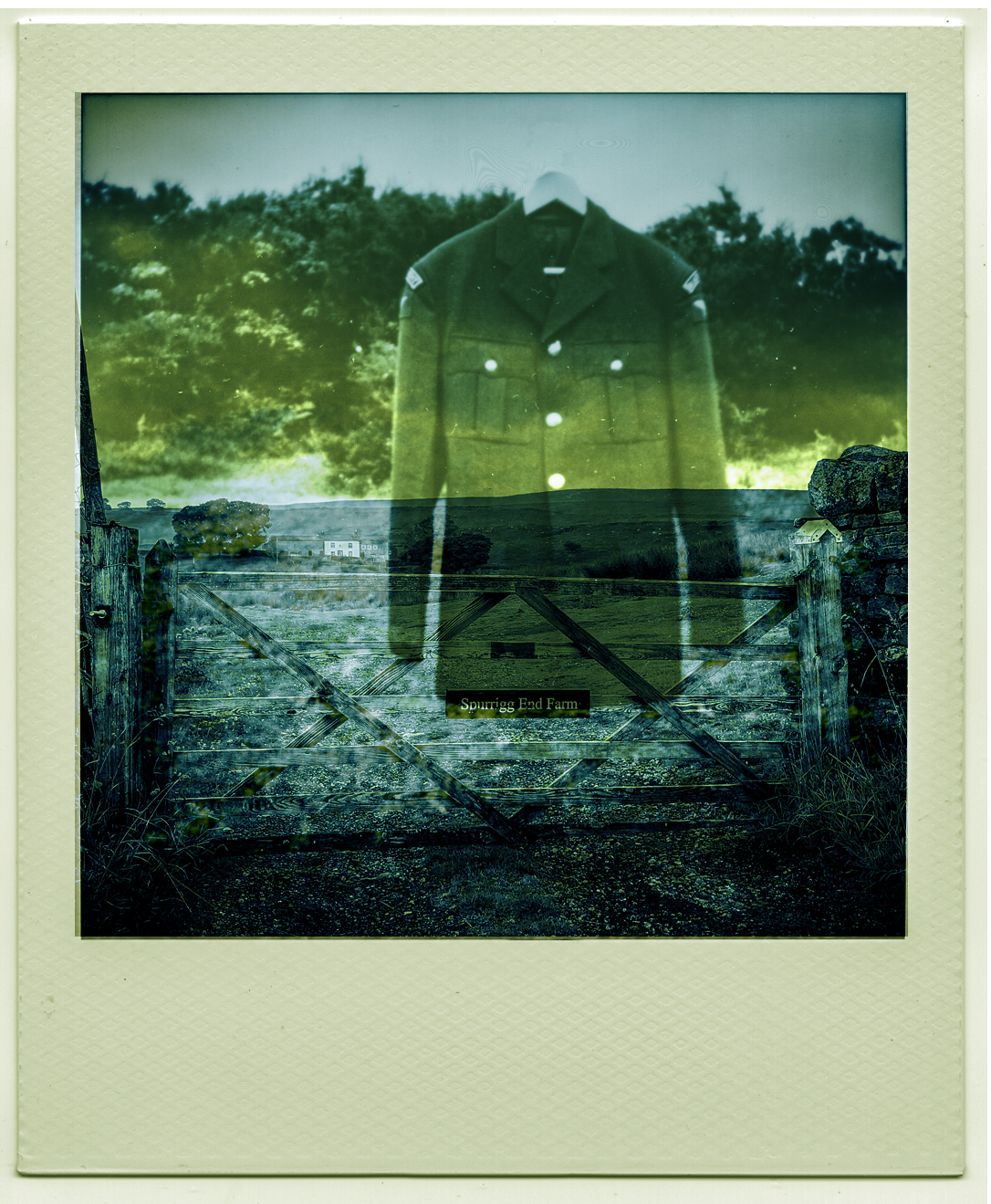
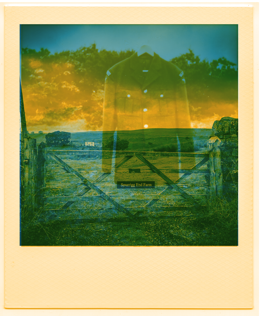
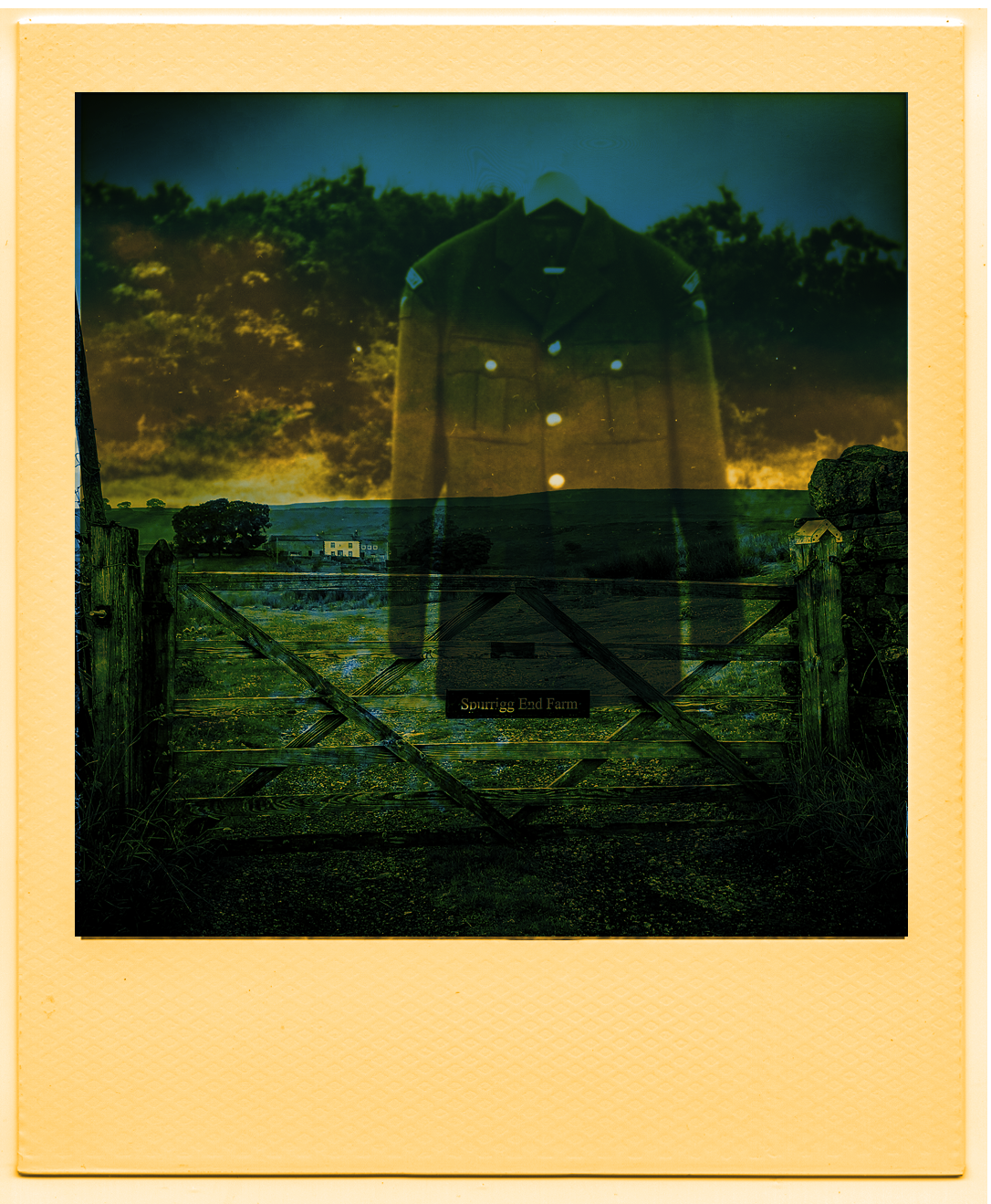

Given that the image I was searching for was an expression of the uncanny, I chose image four as my colour sample.
Combining the two plates, I found that the yellow was much stronger when applied on top of the blue. I had thought that it would be the other way around.