Looking to the 70s
My childhood experience of haunting happened around the early 1970s. My bedroom was decorated with wallpaper typical of the time—on trend!!! It was not what I would have chosen, but Mum surprised me with gloriously colourful, pretty paper.
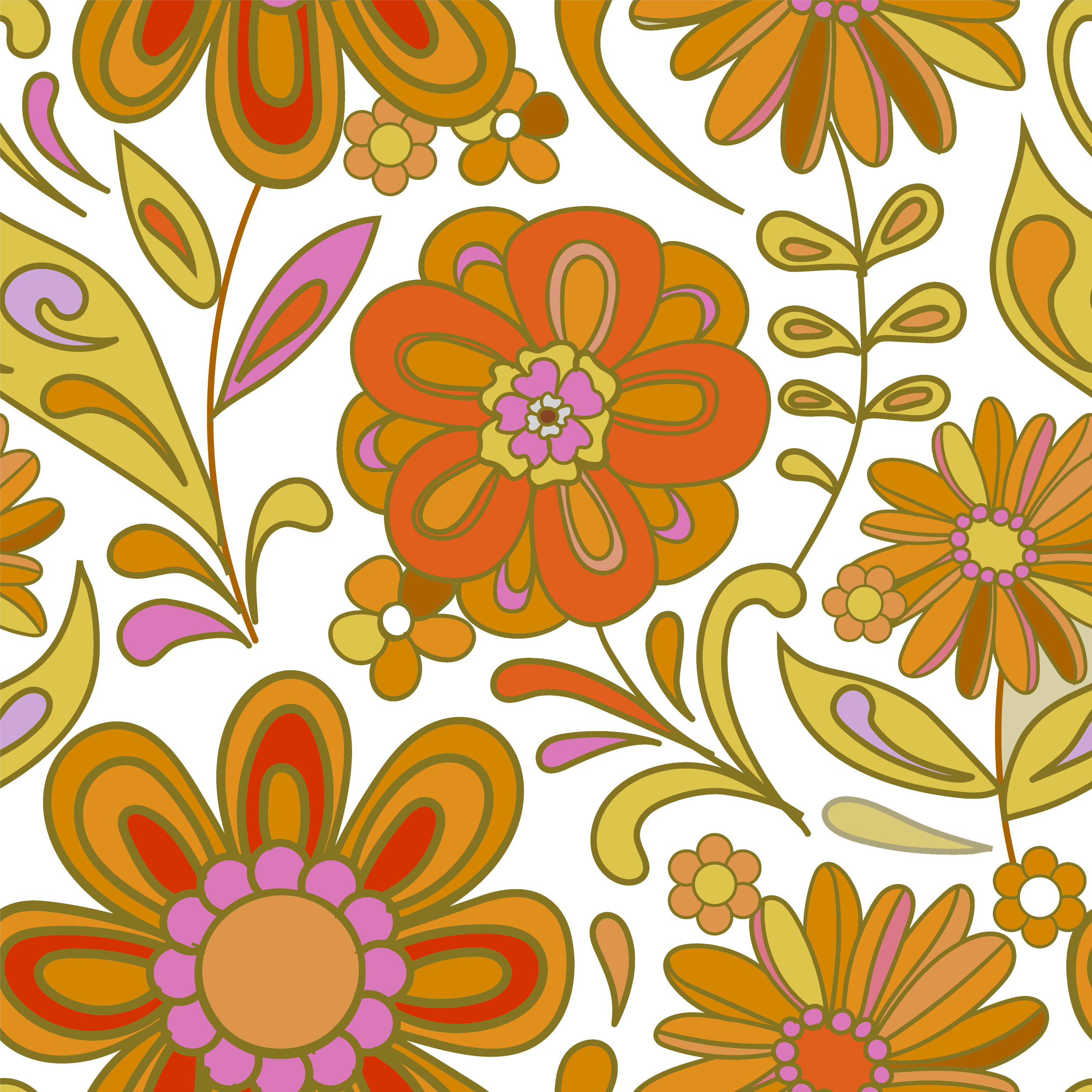
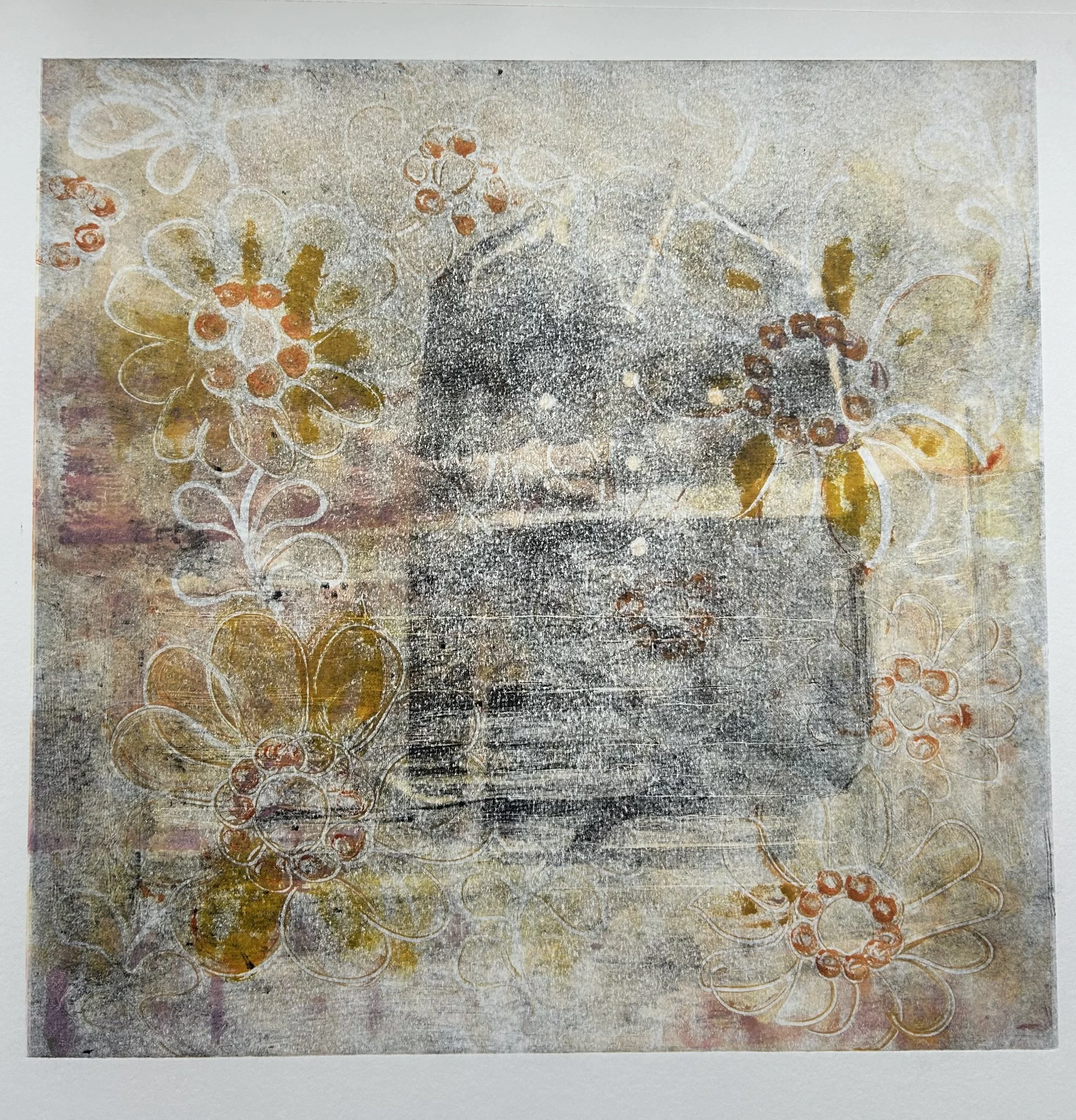
Vintage wallpaper sample.
I aimed to honour this in the background of Haunting 1. Not in a confrontational manner, but to try and place the piece within the context of this era. I didn’t want to merely replicate the design, flat and regular, but adopt the colour and theme.
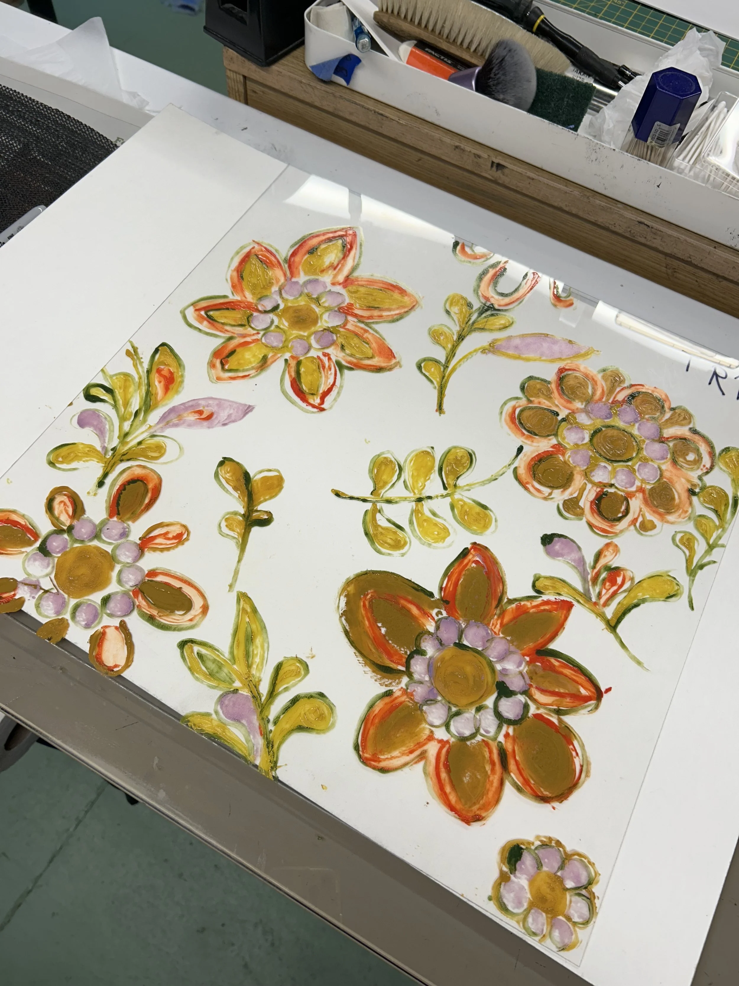
Monoprint plate.
The first attempt had the right colours and shapes but too dense. I wanted an impression of the paper not a depiction.
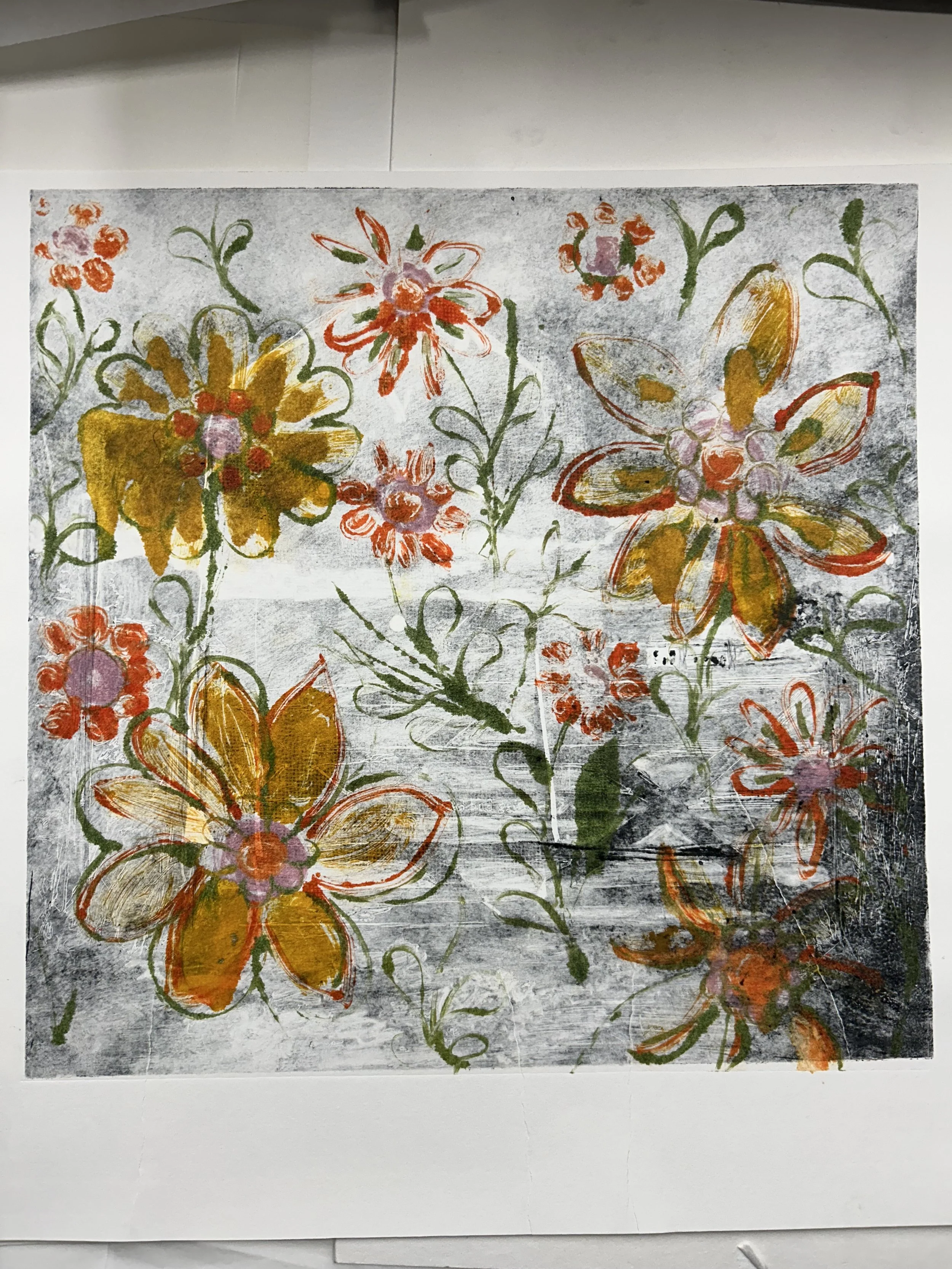
Ghost printing.
The same flower motif but looser and before I printed it ( no image ) I over printed with a pale pink. This gave cohesion to the print.
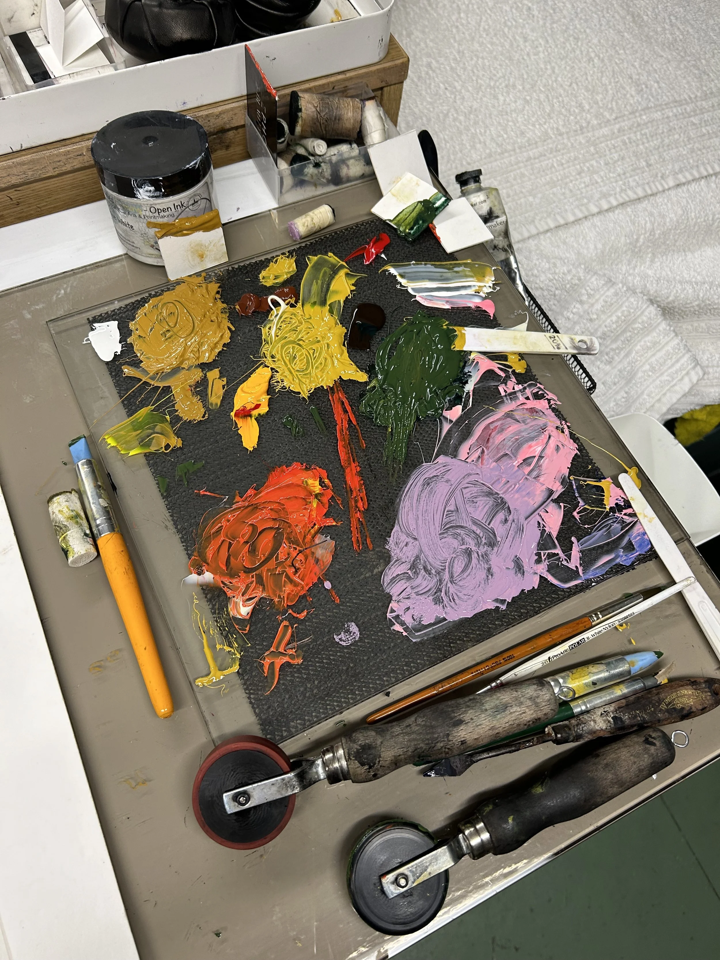
Colours and tools used to create the monoprint.
Monoprinting the background first. I printed variations to give a selection.
The paper was dry. The inks had a lot of extender added as well as copperplate oil to aid flow. Using scrim, sharpened sticks and rubber blenders to form the image. Small squares of fabric taped into tight rolls for ‘a poupee’.
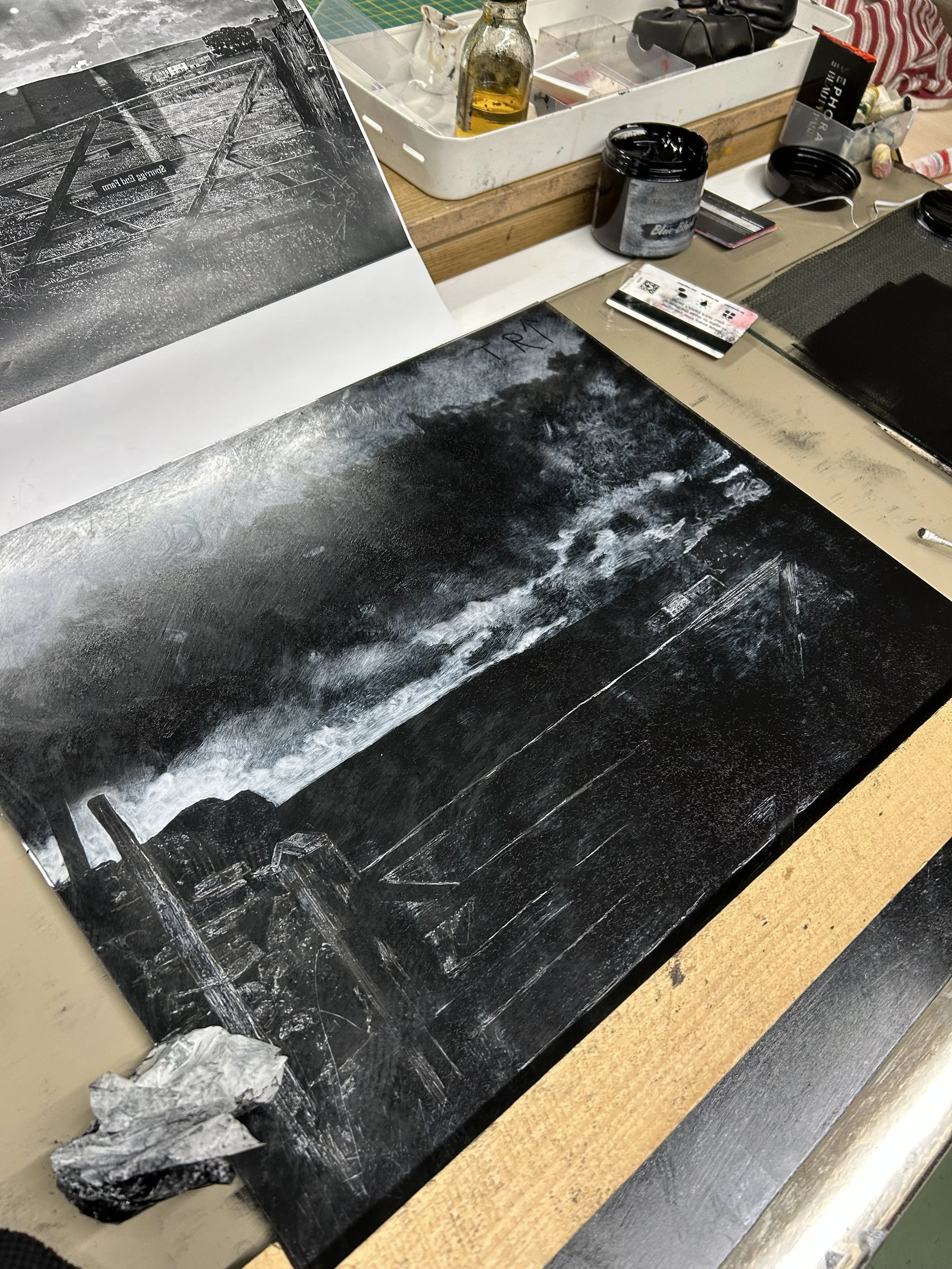
Creating the background monoprint.
The foreground begins with a rollover of blue-black ink. An image emerges from this square of black. The details are added using the same tools employed in the foreground.
In the first print, I used thin bandage material shaped to mask the jacket, placing it on top of the plate to cover the ink. When the image was revealed, the background was dense, with a white hole for the jacket.
Printing the wallpaper onto a ghost image of the plate below.
I then utilised the coloured background to apply the ghost image along with the inked mask shape. This created a striking silhouette for the jacket against a much softer background.
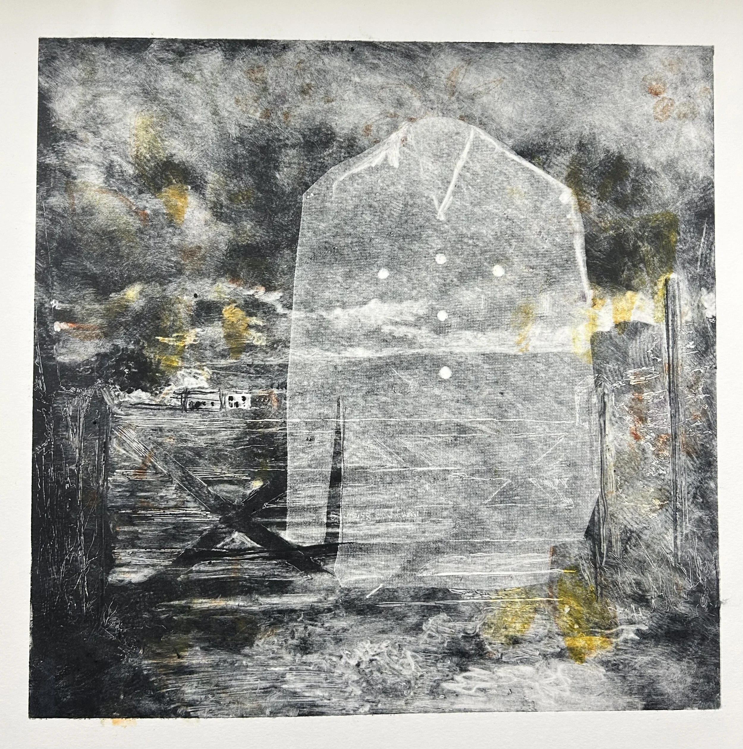
The background has some colour, and the jacket is overprinted.
Using the jacket's mask shape, I rerolled over the first ‘hole’ image, and the material behaved similarly to Chine collé. I intended merely to add detail back into the hole, but this method provided an intriguing and faded layer to the jacket.